Rosa
Junior Scholar

Posts: 200
|
Post by Rosa on Jan 20, 2006 15:20:01 GMT -5
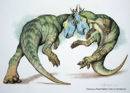
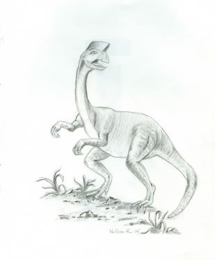
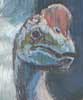
Another piccy for ya'll to explore!  This is number 3 out of the "Dinotopia Close-ups" project that I've been working on. Enjoy and tell me what ya'll think. Please, please, criticize so I know how to improve. Thanks.  BD, SP, Rosa 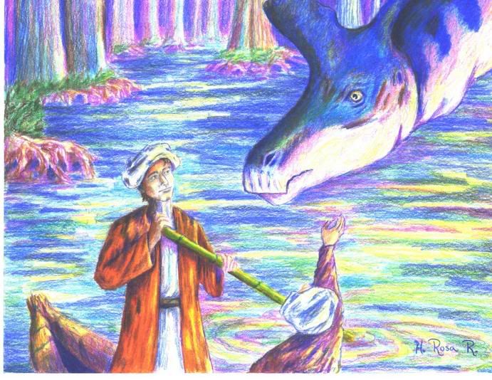 |
|
|
|
Post by Vorchia on Jan 20, 2006 16:32:45 GMT -5
Okay, I sometimes do offer constructive criticism on art but... You want me to criticise THAT  LOL Yeah right, as if I could do that, ask a professional! Its too good for me to find any significant flaws! ;D |
|
Barry
Scholar
 You Steal me Mountain Dew, I kill you!
Posts: 634
|
Post by Barry on Jan 20, 2006 16:48:53 GMT -5
Are you sure that Rosa isn't JG's sibling? j/k ;D
|
|
RedFeather
Junior Scholar
*flap, flap, flap!*
Posts: 423
|
Post by RedFeather on Jan 21, 2006 16:51:38 GMT -5
For real. That's awesome.
|
|
|
|
Post by Azonthus on Jan 21, 2006 17:16:47 GMT -5
Critique?! What's wrong with this picture? It's great! Well... My suggestion for improvement would be to maybe not make the Lambeosaurus look so smooth; try making him look a little more scaly or have a slightly rougher hide. Or, since he IS in a swamp, a little more wet and shiny. Maybe some green swamp scum on the snout if he was sticking it under water and eating? Your cypress roots look fuzzy, not hard and bark-ish. I'd also add some darker lines to them to show how the water level changes.
I like how you made the trees further back lighter; it gives a good sense of depth and makes the colors in the picture more interesting. The human hands and face are great. You have a great sense of color and composition. Keep at it!
|
|
Buttercup
Junior Scholar
Ain't life grand?
Posts: 316
|
Post by Buttercup on Jan 22, 2006 6:51:38 GMT -5
I'm with Vorchia....I can't even really begin to critique this because it is so gorgeous in comparison to anything that I can do...however, I did check Az's suggestions and i definitly could agree there. Other than that, just sit and bask in my admiration! ;D
|
|
Rosa
Junior Scholar
Posts: 200
|
Post by Rosa on Jan 23, 2006 10:14:22 GMT -5
Thanks for the telling me what ya'll thought. What you said, Az, is a great suggestion. On the next dino I'll try to make it look more scaly and yes, I struggle with doing water and your advice definitely makes sense. As for the tree roots, yeah, now that I think about it, the roots are a little fuzzy.  Guess there's always room for improvement. Thanks again, BD, SP, Rosa |
|
Stouthorn
Junior Scholar
"POWER! UNLIMITED POWER!!"
Posts: 341
|
Post by Stouthorn on Apr 16, 2006 5:58:33 GMT -5
I especially like that the colors seem to resemble the illustration of dinosaur vision in ALAFT.  |
|
|
|
Post by Christopher on Apr 16, 2006 12:23:11 GMT -5
Whoa, how did I miss this post?! It's great! I love the details and the colors! Amazing what some people can do with colored pencils.  |
|
sil
Junior Scholar
Leader of one, Lover of Music, Liver of Life
Posts: 202
|
Post by sil on Apr 16, 2006 12:30:44 GMT -5
Um..... If I found anything to critisize I'm sure Vorch and many other members would hunt me down and kill me for uttering such blasphemy. Really Awesome work. Truly beautiful!
*Sigh*
I wish my art was as good.
|
|
Rosa
Junior Scholar
Posts: 200
|
Post by Rosa on Apr 17, 2006 9:36:20 GMT -5
|
|
|
|
Post by Christopher on Apr 17, 2006 15:30:18 GMT -5
|
|
Rosa
Junior Scholar
Posts: 200
|
Post by Rosa on Apr 18, 2006 11:08:02 GMT -5
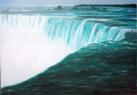
Actually, the pic of the waterfall (Niagara Falls) is done in oil paints. The rest are either graphite or colorpencil. |
|
|
|
Post by Christopher on Apr 18, 2006 20:23:47 GMT -5
Wow, handy with multiple mediums. ;D
|
|

 This is number 3 out of the "Dinotopia Close-ups" project that I've been working on. Enjoy and tell me what ya'll think. Please, please, criticize so I know how to improve. Thanks.


 Guess there's always room for improvement.